

Customizing typography
Choose a font pairing, text size and density for your resume, or pick any of about 500 fonts with exact sizes, weights and line height.
The Type group in Design controls how your text looks: the fonts, the text size and how tightly lines and sections are spaced. Five ready-made font pairings cover most resumes. If you need a specific font, Advanced lets you choose from about 500.
Pick a font pairing
Open Type
In the editor, select Design (or press 2), then select Type in the row of links at the top of the panel.
Choose a pairing
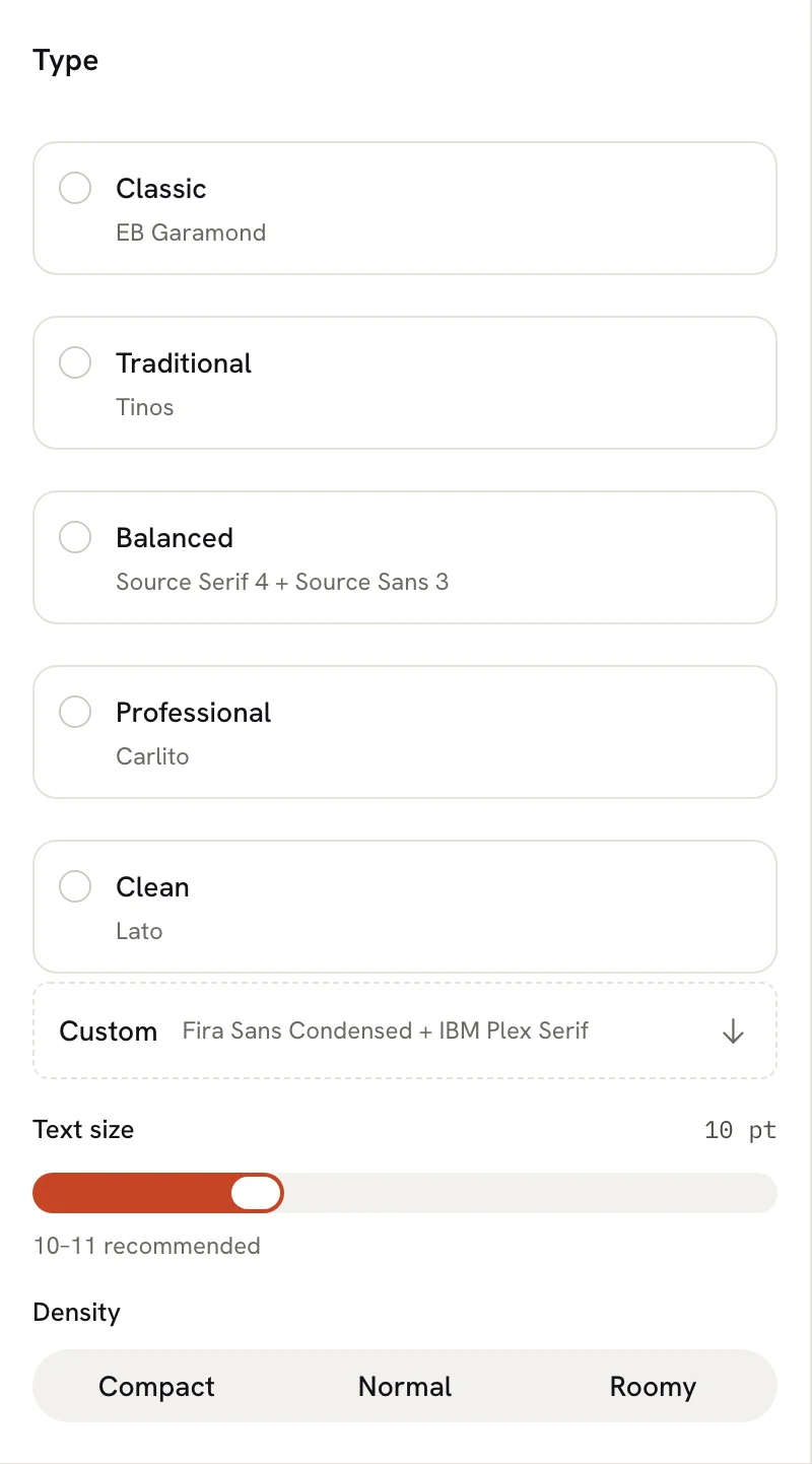
Select one of the five pairings. The page updates straight away. Each pairing shows the fonts it uses next to its name.
| Pairing | Heading font | Body font |
|---|---|---|
| Classic | EB Garamond | EB Garamond |
| Traditional | Tinos | Tinos |
| Balanced | Source Serif 4 | Source Sans 3 |
| Professional | Carlito | Carlito |
| Clean | Lato | Lato |
A pairing sets body text in Regular and Bold, and headings in a single bolder weight. Tinos and Carlito match the widths of Times New Roman and Calibri, so they suit employers who expect a traditional look.
If your resume uses fonts that aren't one of the pairings, no pairing is selected and the Custom row shows your current fonts instead.
Set the text size
Drag the Text size slider. It goes from 9 pt to 12.5 pt in half-point steps, and the current value shows on the right. Headings grow and shrink with it, keeping the same proportion to the body text. The panel suggests 10–11 pt, which reads comfortably on screen and on paper.
Dragging a slider counts as one change, so a single ⌘ Z (Ctrl Z on Windows and Linux) undoes the whole drag.
Choose a density
Density sets the line height of your body text and the vertical spacing in and between entries:
| Density | Line height | Vertical spacing |
|---|---|---|
| Compact | 1.35 | 4 pt |
| Normal | 1.5 | 6 pt |
| Roomy | 1.65 | 8 pt |
If you set an exact body line height or Spacing (Vertical) in Advanced that doesn't match one of these, no density is selected.
Use any font
Open the font editor
Select the Custom row under the pairings. Design opens Advanced and moves you to its Typography editor, with the body font picker ready.
Choose a body font
Open Font Family under Body and type part of a font's name to search. Each font is shown in its own typeface. Choose one to apply it.
Choose a heading font
Do the same under Heading.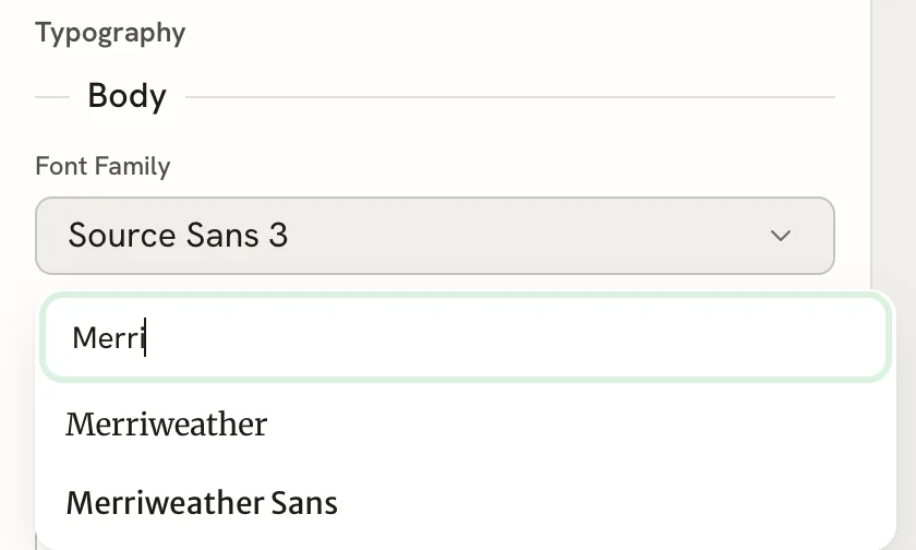
The list contains Google Fonts plus the PDF standard fonts Helvetica, Courier and Times-Roman. Fonts for Chinese, Japanese, Korean, Arabic, Hebrew and Thai text are included, and missing characters fall back to a matching Noto font so they still print.
Exact typography settings
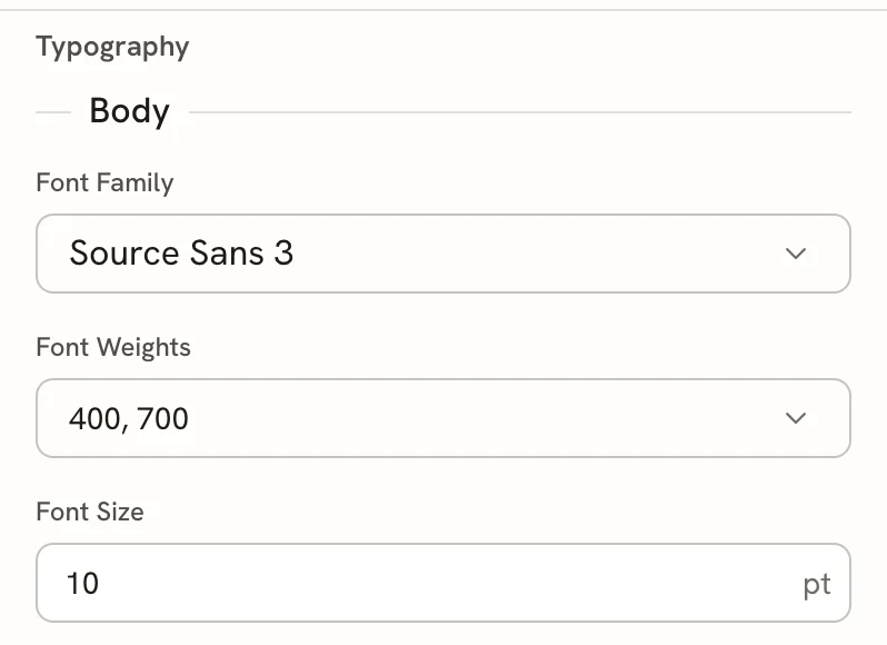
Advanced → Typography has the same fields for Body and Heading, plus one Hyphenation switch for both:
| Field | What it does |
|---|---|
| Font Family | The font, from the full list. Choosing a new family picks regular and bold body weights, preferably 400 and 700 when available, or one heading weight, preferably 600. |
| Font Weights (body) / Font Weight (heading) | Which weights to use, from those the font offers. Body text can use several (for example 400 for regular and 700 for bold). |
| Font Size | Any size from 6 to 24 pt, in steps of 0.1 pt. |
| Line Height | A multiple of the font size, from 0.5 to 4. |
| Hyphenation (one switch for all text) | Breaks long words between syllables, using the language set in Page. Useful for languages with long compound words, such as German. |
The Text size slider in Type only goes from 9 to 12.5 pt. If you type a size outside that range in Advanced, the slider stops at its nearest end but your exact size is kept.
Cover letters have the same Type controls in their own Design mode, without the Custom row. See Writing a cover letter.
Related guides
- Choosing colors: set the accent color that headings use.
- Fitting content on a page: use size and density to fit your pages.
- Applying custom styles: change styles that Design doesn't cover, with CSS.